Rotting on Purpose: Why Gen Z Is Choosing the Ugliest Corners of the Internet

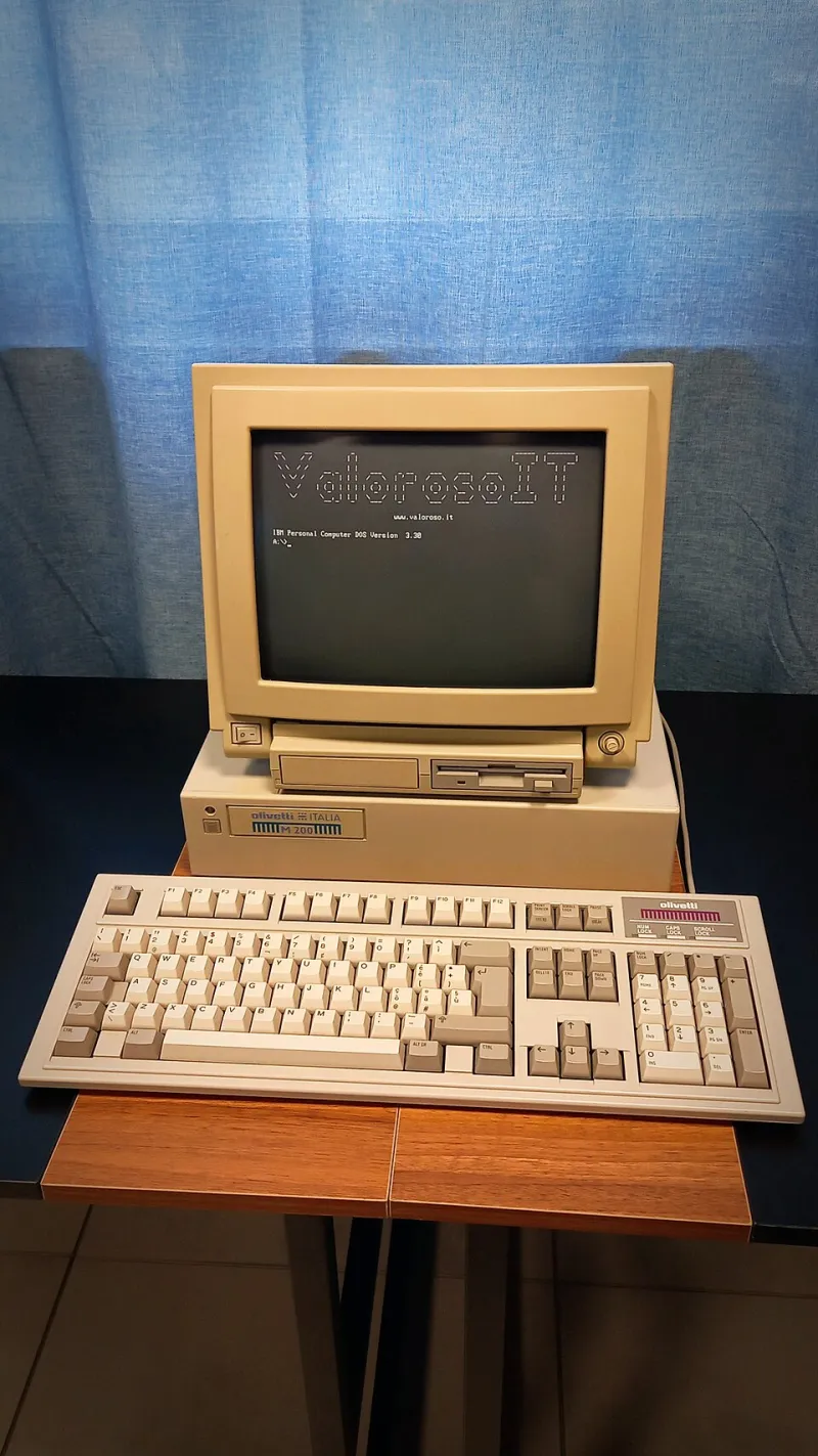
Photo: Hewlett-Packard (progettista/ costruttore), CC BY-SA 4.0, via Wikimedia Commons
The website has a tiled background that looks like it was lifted from a 2003 middle school computer class project. The font is Comic Sans, unironically deployed. There are at least three animated GIFs on the homepage — a spinning globe, a blinking "under construction" sign, and what appears to be a dancing skeleton. The navigation doesn't work on mobile. The color palette is aggressively wrong.
And it has 40,000 monthly visitors, most of them under 25.
Welcome to the aesthetics of intentional decay — one of the stranger and more fascinating cultural movements happening right now in digital spaces. Call it web rot chic. Call it ugly-core. Whatever you call it, it's real, it's growing, and it says something genuinely interesting about where online culture is headed.
The Rebellion Nobody Expected
To understand why deliberately bad web design has become a statement, you have to understand what it's reacting against.
For the better part of a decade, the visual language of the internet has been defined by a kind of frictionless, algorithm-approved perfection. Clean sans-serif fonts. Pastel palettes. Grid layouts that feel like they were generated by the same three mood boards. Influencer aesthetics so polished they barely register as human. Every platform, every brand, every creator profile converging toward the same optimized visual sameness.
It's not that this design language is bad, exactly. It's that it's everywhere, all the time, in a way that has started to feel suffocating — like the entire internet got a single interior decorator and nobody was allowed to object.
So some people started objecting. Loudly, and with terrible typography.
"There's something that happens when everything looks the same," said Dani, a 22-year-old in Portland who runs a personal site that she describes as 'deliberately hostile to the eye.' "It starts to feel like the internet is performing for you instead of existing for itself. The ugly stuff feels like it actually exists."
The GeoCities Ghost
The touchstone for most of this movement is the early web — specifically the chaotic, user-built internet of the late 1990s and early 2000s. GeoCities. Angelfire. Homestar Runner. Personal pages with visitor counters and guestbooks and backgrounds that made your eyes hurt.
That era of the internet was defined by extreme creative autonomy and zero design standardization. Anyone could build anything and it would look completely different from everything else. The web was genuinely weird because individual weirdness was the default, not the exception.
What Gen Z is doing — and this is the part that's easy to misread — isn't simple nostalgia. Most of them weren't alive for GeoCities in its prime. This is something more like archaeological fascination. They're digging up a version of the internet that their generation never got to use and asking why it felt more alive than what replaced it.
Platforms like Neocities, which lets users build free-form personal websites without templates, have seen significant growth driven almost entirely by younger users. The sites people are building there look nothing like anything you'd find on Instagram or Squarespace. They look like someone's actual brain — messy, specific, occasionally incomprehensible.
Ugly as Cultural Capital
Here's where it gets more interesting. In certain online communities, the deliberate embrace of digital ugliness has become a genuine status marker. Not in spite of how it looks, but because of it.
The logic works something like this: a perfectly optimized, aesthetically smooth online presence signals algorithmic compliance. It means you've internalized the platform's visual rules and performed accordingly. An intentionally clunky, weird, hard-to-navigate digital space signals the opposite — that you exist outside those rules, that you're not trying to be discovered by an algorithm, that your audience finds you some other way.
In underground music circles especially, this dynamic has become pronounced. Artists releasing music through deliberately archaic-looking Bandcamp pages with no press photos and no social media links. Labels with websites that look like they were last updated during the Bush administration. Zine culture migrating back to literal PDFs with no mobile optimization.
"If your website looks like it was designed to go viral, it probably was," said Marcus, a 24-year-old running an experimental electronic music blog out of Brooklyn. "The uglier it is, the more you know someone built it because they wanted to, not because they were trying to grow an audience."
This is the counterintuitive heart of the whole thing. In a media landscape where every aesthetic choice is legible as a growth strategy, choosing an aesthetic that actively resists growth reads as authenticity. The decay is the signal.
The Craft Inside the Chaos
It would be easy to dismiss all of this as ironic posturing — kids doing something ugly just to be contrarian. But spend time in these spaces and a different picture emerges. A lot of the deliberately bad web design being produced right now is actually quite technically intentional. People are learning CSS just to break it in specific ways. They're studying old browser rendering quirks to replicate them accurately. They're building sites that look chaotic but are structurally coherent underneath.
There's also a genuine community infrastructure forming around these aesthetics. Webrings — the old practice of linking personal sites together in a chain — are making a comeback. Small newsletters with no growth aspirations are thriving. Private forums with strict invite policies are filling up with people who want online spaces that don't feel like they're being watched.
Which is maybe the deepest thing the ugly internet revival is about. It's not really about aesthetics at all. It's about reclaiming spaces that don't optimize for you, that don't track you, that don't want anything from you except your presence.
What the Decay Is Actually Saying
The internet that Gen Z inherited is extraordinarily powerful and extraordinarily legible. Every platform knows what you want before you do. Every interface is designed to keep you inside it. Every aesthetic is calibrated to maximize engagement.
Choosing the broken, the outdated, the deliberately hard to look at — it's a way of stepping outside that system, even briefly. Of saying: this space exists on its own terms, not yours.
The dancing skeleton GIF isn't the point. The point is that someone put it there because they wanted to, and no algorithm told them it was a good idea.
In 2025, that might be the most radical thing you can do online.